Choosing paint colors for your home isn’t just about picking shades you like; it's about understanding the science behind color and how it affects the ambiance, mood, and overall feel of each room.
After all, the right color choice can make a space feel larger, cozier, or more inviting or even increase focus. Keep reading to explore how to select the best hues for each room in your Odessa home, considering both the aesthetic and psychological impacts of color.
Color Psychology in a Nutshell
Color psychology delves into how different shades impact emotions and perceptions. Colors are generally categorized as warm, cool, or neutral — each with its own psychological and aesthetic influence.
Warm colors (think reds, oranges, and yellows) tend to energize, stimulate conversation, and make spaces feel cozy. Cool colors (blues, greens, and purples) promote calm and often make rooms appear more spacious. Meanwhile, neutrals (whites, grays, and beiges) are versatile, offering balance and acting as a blank canvas that aligns with various decor styles.
So, before you choose a color, ask yourself what mood you want to create in the room. Whether you’re after vibrancy or tranquility, the science of color will guide your choices.
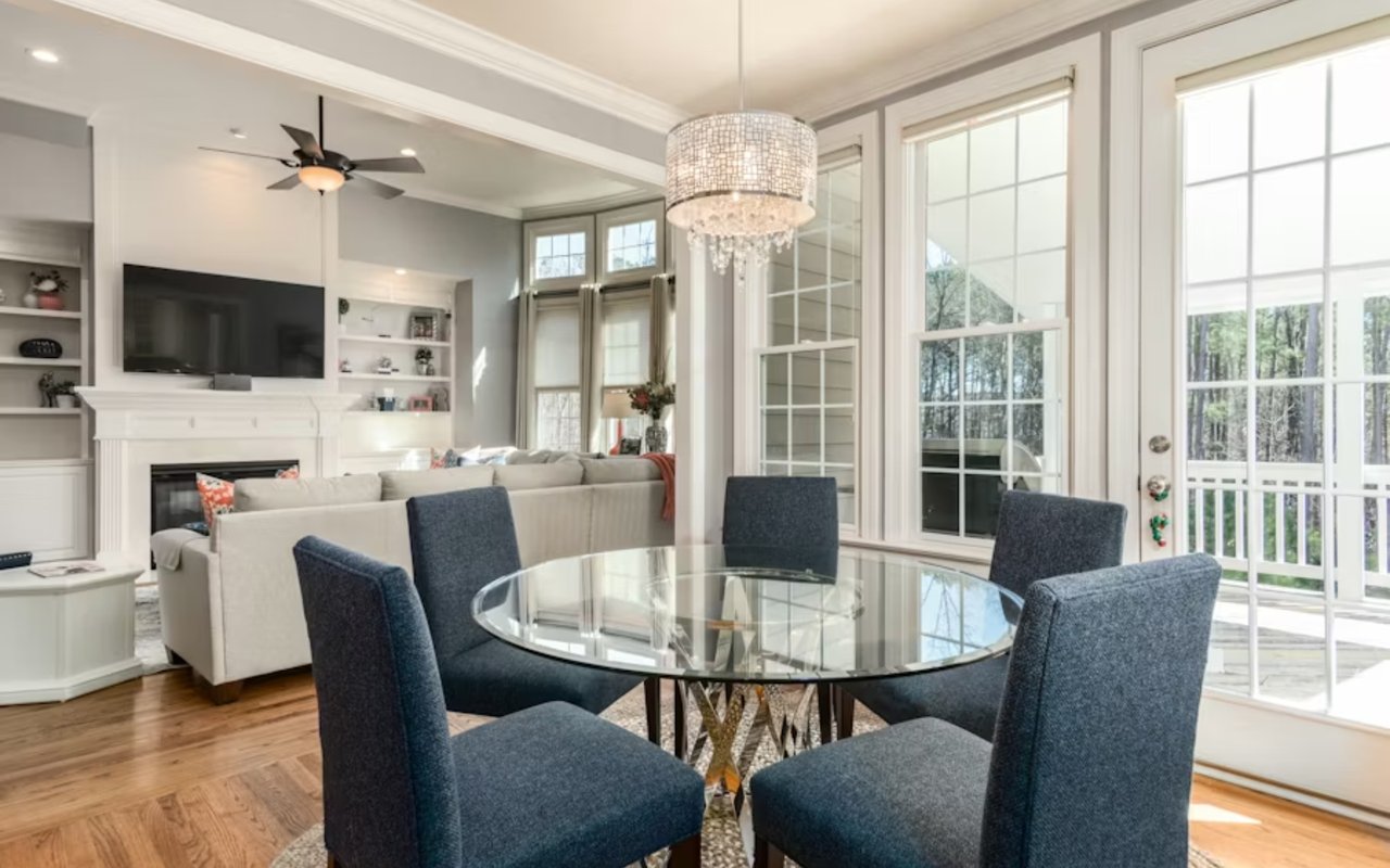
Living Room: Create a Warm Welcome
The living room is where people gather, unwind, and socialize. Choosing the right color here can encourage comfort and conversation. Warm tones like beige, warm grays, or soft oranges can create a welcoming atmosphere, while earthy tones add a grounded, cozy feel.
If you prefer a more relaxed, modern look, consider cool colors like soft blues or muted greens, which give a clean, airy effect without overwhelming the space. When picking shades, also consider the room’s natural light — north-facing rooms often benefit from warm tones to balance cooler lighting, while south-facing rooms can handle cooler shades.
Kitchen: Add Energy with Bright Tones
Kitchens are often lively spaces where energy is essential. Yellows, warm whites, and even soft greens can create an uplifting, energizing atmosphere. Yellow in particular is known to stimulate appetite and joy, making it a great choice for kitchens and breakfast nooks.
For a sleek, modern kitchen, cool neutrals like slate gray or navy blue can add sophistication without sacrificing energy. Pair these with metallic accents or wood textures to keep the space from feeling too stark. And if you’re worried about painting walls, consider color in smaller doses through cabinets or kitchen island accents.
Bedroom: Invite Calm with Cool Colors
Bedrooms are sanctuaries meant for rest and relaxation, so cool colors work wonderfully here. Blues, soft greens, and gentle lavenders can help promote relaxation, making them ideal for restful sleep.
If you prefer warmer hues, opt for lighter, earthy shades like soft blushes or creamy taupes. These colors can still offer warmth without becoming too stimulating. And remember, when choosing bedroom colors, go for shades that make you feel at ease the moment you step into the space.
Bathroom: Fresh and Refinement
In bathrooms, cool tones like aqua, light gray, or crisp white promote a sense of cleanliness. Light blues and greens bring in a spa-like sense of calm, creating an oasis-like ambiance that many homeowners enjoy.
If your bathroom lacks natural light, consider warmer neutrals that can make the space feel brighter without overpowering it. For those seeking a pop of color, accent walls or colorful tile choices can add visual interest without overloading the room.
Home Office: Boost Focus and Productivity
The color you choose for a home office can significantly impact productivity. Cool tones like blue or green enhance focus and reduce stress, making them excellent choices for these workspaces. Blue tones promote clear thinking, while green can help ease eye strain, particularly if you spend long hours on the computer.
If you want something more dynamic, consider a subdued yellow or mustard tone. These colors add energy without overwhelming the senses, striking a balance between focus and creativity.
Dining Room: Encourage Connection with Warm Colors
Dining rooms are places of gathering and conversation, making warm colors like reds, deep oranges, and terracotta excellent options. These tones are known to stimulate energy and conversation, creating an inviting atmosphere.
If bold colors feel too intense, try muted warm shades or even warm neutrals with a hint of color, like taupe or warm beige. These colors still add warmth but allow for a more versatile style if you like changing up your decor.
Choosing Colors for Open-Concept Spaces
Open-concept layouts can be challenging because multiple areas share the same visual space. One approach is to stick with a cohesive, neutral color palette for walls and use furniture, rugs, and decor to introduce accent colors. Soft grays, beiges, or light tans work well as base colors, creating a smooth flow from room to room.
Alternatively, you can create zones within the open space using different but complementary colors. For example, a subtle transition from light gray in the living area to a soft blue in the dining area adds dimension without disrupting the flow.
Balancing Color with Natural Light
Natural light plays a significant role in how colors appear. Rooms with ample sunlight can handle darker tones because the light prevents them from feeling too heavy. To get an accurate sense of how a color will look within the space, paint a sample swatch on each wall and observe it at different times of the day. This approach gives you a true representation of how the color will interact with natural and artificial lighting in the room.
Using Color to Manipulate Space
Color can also create illusions of space. Lighter colors tend to make rooms feel larger, so if you’re working within a smaller room, opt for pale blues, greens, or soft neutrals to open up the area. Darker colors, on the other hand, can make a room feel more intimate, so consider these options for larger areas where you want a cozy, inviting effect.
If you have low ceilings, painting them a lighter color than the walls can make them appear higher. For narrow rooms, painting the shorter walls a slightly darker shade than the longer ones can make the room feel more balanced.
Ultimately, choosing the right paint tones is about more than just aesthetics — it’s a process of crafting the atmosphere you want to experience every day. By understanding the psychology behind each hue and how it interacts with light, furniture, and finishes, you can transform your Odessa home to align perfectly with your vision. Whether you’re after a serene retreat, a vibrant kitchen, or a welcoming living room, the science of color offers endless possibilities to make each space truly your own.
Jason & Dyan Pithers with The Pithers Group at Coldwell Banker Realty work with highly skilled interior designers, staging specialists, and trusted contractors on a regular basis. Are you looking to make changes to your Odessa, Fla home or complete renovations before listing your Odessa, Fla home for sale? Get in touch with Jason & Dyan Pithers with The Pithers Group at Coldwell Banker Realty today!